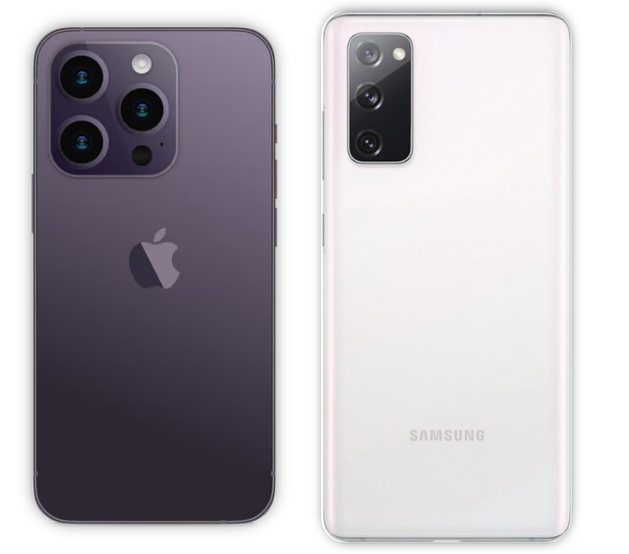
Switching from Android to iPhone
10 Aug 2023The age old debate (at least since the modern smart phone has taken off). iPhone or Android? Android isn’t really one thing: Google, Samsung, Nokia, LG, and some international brands. So it’s not just ‘iPhone vs Android?’. Regardless, I’ll be talking through my recent experience of switching from an Android (Samsung Galaxy S20 FE) to an iPhone (iPhone 14 Pro).
Note: From here on out, when I say Android I’m referring to my Galaxy S20 FE. When I say iPhone I’m referring to my iPhone 14 Pro.
I’ll be honest. I had high expectations, because every single Apple user I talk to seems to indicate that all Apple products are the best thing since sliced bread. Of course I’ll have a great experience! Apple is obsessed with user experience (UX), sleek designs, performant custom hardware, and seamless integrations! Why would the experience be bad?
With that said, here were my expectations:
- A pleasant user experience
- Good UI
- Ease of onboarding
- Fast device (with good battery life)
I think these are reasonable expectations. I’ve written this article over the course of 1-2 months to give me ample time to let the transition digest (let’s not be too hasty here). Throughout that time, I’ve updated this article with things that bug me, or pleasantly surprise me.
With that said, let’s get into the juicy details.
The Bad
We’ll start with the bad experiences and end with the good ones, because everybody likes leaving things off on a good note right? Right off the bat Apple, hits us with this whopper. This is before I even have a chance to buy the iPhone.
Need Apple Device to Recover AppleID
Ok. So, like many Android users (I suspect), I had an AppleID associated with my email that I created a very long time ago for iTunes or something. I have a password manager, but I must have made this AppleID before I ever started using a password manager. I tried to sign in a few times, realized I didn’t remember my password, and clicked “Forgot Password”, no big deal right? Wrong.
Apparently, it’s impossibleyes, impossibleto recover your AppleID password without an Apple device. Why? Maybe security or something, I don’t know, I guess email isn’t secure enough like it is for literally every other service that requires a password in existence. So, I scrambled for a hot minute, thinking I wouldn’t even be able to order this thing. Finally, I realized I could probably use my work MacBook for this.
Cool, that’s figured out now. Except… you need an iPhone or an iPad to access the Apple Support App. So, the only way you can reset your AppleID password is if you have an Apple device that is an iPhone or an iPad. I’m SOL.
Then, I found out my AppleID was signed in on my work laptop (yea, stupid I know, I know, it’s signed out now) so I was able to reset it there.
If none of the above had worked for me, there’s the final nuclear option which is to reset it from the web. I didn’t feel like going through this process because it’s laborious and takes an indeterminate amount of time. Here’s what Apple says on their official help article:
If you don’t have a trusted device, you can reset your password on the web — but the process might take a little longer.
When possible, the web process redirects you to a trusted device. If you’ll have access to one of your trusted devices soon, it might be faster and easier to reset your password then.
So, even with the web reset, you still need access to a trusted Apple device. If I had gotten to this point, I would have had to take my sorry butt to an Apple store somewhere, talk to a person, use one of the physical devices there to finally get this done. And all this just to buy the dang thing. I’m TRYING to give you my money Apple, and you make it THIS DIFFICULT.
Final note: The reason I needed my AppleID is because I wanted to take advantage of the 0% APR that you get with an Apple credit card. This is only available by signing in, perhaps I could have bought the device for the fully listed amount without the AppleID
No Biometrics
This one is pretty short, but very aggravating. TouchID has been deprecated on iPhone since the iPhone 8 Plus. This means, every time you sign in to your iPhone, you either have to use a 6-digit passcode, type out a character-based password, or use FaceID. Signing in with a fingerprint on my Android has been extremely convenient. It takes no additional screen space because it’s literally an invisible UI feature that shows up when you place your finger in the spot.
I have no idea why Apple deemed FaceID to be superior and not even give the user the choice to user fingerprints. This annoys me so, so, so, soooo much. FaceID is goofy as heck and I’m not going to be unlocking my phone by scanning my dumb face when I could just put my finger on the phone and have it instantly unlocked.
Edit (after about 2 weeks): I’ve enabled FaceID and I had some misconceptions about how it worked. It’s actually a very pleasant experience, but it is annoying having to make sure I align my face with the camera before being able to open the phone. With my Android, I could usually unlock it as I was pulling it out of my pocket by placing my thumb on the fingerprint sensor. So, FaceID is nice, but I still don’t see why there’s no option to use TouchID.
This problem has a domino effect too. 1Password, my password manager, allows me to use biometrics on Android. So, every time I need to use a password, I just tap my thumb. Now, every time I need to enter a password I have to type my 6-digit code into my iPhone.
Not only this! A 6-digit password is a strong security measure, but not the strongest. A lengthy character-based password is much stronger than a 6-digit passcode. However, since I need to put this password in. Every. Single. Time. I want to do anything that requires a password, I opted for the 6-digit passcode.
On my Android, I used the lengthier more secure character-based passcode since I only have to enter it when the phone restarts, or once every 2 weeks to refresh the 1Password credentials.
This means my iPhone is less secure because I value convenience more than security. And how many more people is this also true for?
Edit (after about 2 weeks): Like my previous edit suggests, most of this section is no longer relevant. However, I do wonder how secure FaceID is as opposed to TouchID. I could only find PR fluff articles, but nothing very definitive. Me and my brother look very similar, and my FaceID wouldn’t work for him, so that suggests it’s reasonably secure. And, once again, why does Apple insist on removing even the option of using something you prefer?
Crapware
Oh, how I longed for the walled-garden of the Apple Store
I finally have my Apple device,
so I can enter the blessed garden locked away in Apple’s ivory towers
Finally!
No more annoying privacy invasions,
no more ugly UI,
no more crapware,
no more…
Wait? Did you say crapware still comes with the iPhone? What?
Yes, that’s right. And I even got an unlocked iPhone directly from Apple to avoid all the dumb vendor specific garbage that AT&T and Verizon like to put on your phone. I figured it would be a clean slate with nothing to remove, but I was wrong.
There were several apps that may be useful to some people, but are just annoying and things I had to manually uninstall. Here’s a short list:
- Apple News
- Garage Band
- iMovie
- Numbers
- Stock App
- Etc.
These are all Apple apps, but why are they coming pre-installed on my phone? Just give me the option to install them. I would never want to use most of these business-y apps on a phone anyways.
There is, however, one plus here.
Uninstalling these apps was trivial. On Android, I know vendors like to place appslike DirecTV or Samsung Pay that are literally impossible to uninstall unless you connect your phone to the PC and run some magic CLI commands in the Android Developer CLI. So, kudos to Apple for making it trivial to uninstall Apple crap.
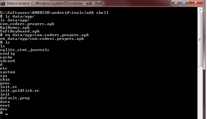
Android CLI Nightmare
Gestures Suck
I recently switched from a crappy Dell laptop to a MacBook M1 Pro for my work. This allowed me to discover the glorious bliss of the Apple trackpad. This trackpad, is, in a word, sublime. Before using a MacBook, I exclusively used a separate keyboard/mouse because trackpads SUCK. Little did I know that they could be so intuitive and fun to use, but, good ol’ Apple dispelled me of that notion.
Given my experience with the trackpad I was pretty psyched to see what goodies awaited me in iPhone land? Surely iPhoneswhich are based around touchwill have even cooler gestures right? Well… not so much. Let’s just say, I was a tad disappointed. So, what went wrong?
There are too many controls to do what should be one thing. It gets confusing, and it’s very easy to mistakenly make a gesture you didn’t want to do, and at the same time very difficult to do what I would consider are common gestures. First, let’s discuss what Android does.
On my Android, when I swipe down from anywhere on the screen, it pulls down an overlay with lot’s of goodies: notifications, widgets, settings, etc. (see the image below). When I swipe down a second time, I see all the widgets in a bigger screen so I can select more of them. This is entirely customizable. I can reconfigure the top-bar of widgets to be whatever I use the most often (and I have reconfigured it).
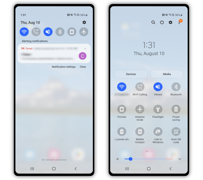
Android Widgets
And let me re-emphasize. I can swipe down from literally anywhere on the screen, and it always does this one thing. Swiping up on the other hand opens up the Android app library. This library is a list of all installed apps on your phone. Likewise, swiping up from anywhere on the phone does this.
Of course, these swipes only take effect when no app is open, but iPhone does the same thing and I assume the reader is aware of this.
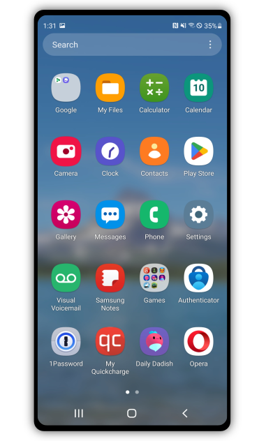
Android App Library
Swiping left or right on the home screen will take you to any additional screens you have. Swiping left or right in your app library will take you to the next page or previous page of apps.
Ok enough with Android, let’s see what iPhone does. Well, if you are on your iPhone’s home screen you can do one of the following:
- Swipe down from the top-right of the screen (ensuring you’re at the top of the phone, that’s important). This pulls down your widgets menu.
-
Swipe down from the top-left-ish of the screen (ensuring you’re at the top of the phone). This pulls down you’re notifications/lock screen (but it doesn’t actually lock it?).
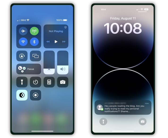
In order: iPhone Widgets, iPhone Lock Screen
- Swipe down from somewhere that’s not the top of the iPhone. This opens up a search menu that searches the web + your apps (+ maybe the settings?).
- Swipe up from the very bottom to about 3/4 of the way to the top of the screen. This shows you all your active apps.
-
Swipe up from the very bottom (but make sure not to accidentally swipe down as you lift your finger up from the screen) and swipe to the right a bit. This also shows your active apps.
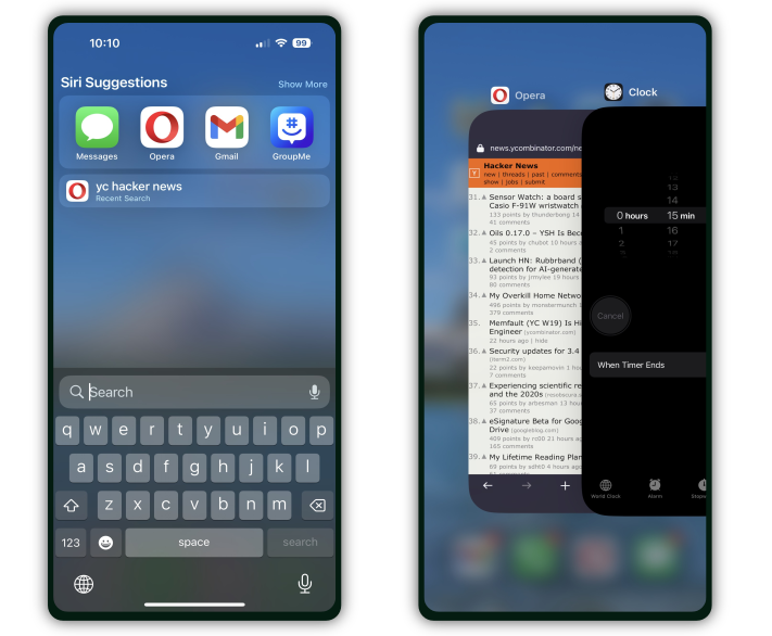
In order: iPhone Search, iPhone Active Apps
- Swipe up from the very bottom of the screen, then swipe down. This opens your last active app.
- Swiping left-right does the same thing that it does on Android.
Wow… This is, how can I put it, unique? Now, we have to ask ourselves, why does Apple have all these crazy gesture controls while Android doesn’t? Well, maybe you noticed something on the Android pictures above. You see that?
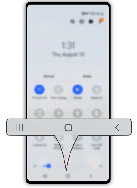
Superior Android Buttons
Yea, those three little buttons offer all the things the gesture controls on iPhone do (and more!) while having one unambiguous purpose. The button on the left will show all the active apps. The button in the middle will take you home. The button on the right will take you one step back (whether that’s back to the last app you used, or when you’re browsing the internet taking you back one page). These buttons, literally obsolete 80% of the gestures iPhone has to support because they refuse to add buttonsbut remember, the iPhone is minimal. MINIMAL.
By the way, these aren’t real buttons. They are buttons made in software. So an app like YouTube can use the full screen, and make the buttons “disappear”. Then, you can make the buttons reappear by just swiping from the very bottom of the screen.
Ok, I spent a lot of time on gestures, because I really had high hopes from Apple here after using the MacBook trackpads and was sorely disappointed with the abysmal state they are in.
Edit (after about 2 months): I had a suspicion that maybe iPhone gestures were made for people that are less tech savvy than myself. I was dispelled of this notion after going on a long drive with my dad and asking him to change songs or update the directions on my phone. He’s been using an iPhone for around 5 years at this point, and he had no idea how to use the gestures. So take of that what you will.
Can’t Rearrange Icons
On Android, I can put the icons on my home screen wherever the heck I want. Do I want a couple at the top and some at the bottom of the screen? Cool, I can do that. On iPhone, you can only have them placed top -> bottom and left -> right. You can rearrange them, sure, but you can’t place them wherever you want. This is such a trivial thing to add, and yet there’s no support for it! It’s not like I’m some weirdo with a feature request that is absurd and has never been asked for (maybe I am a weirdo, but that’s up for debate). Here’s somebody asking how to move the dumb icons. And a reddit discussion, and another.
People have literally resorted to using an app with an invisible icon and no name to rearrange icons to their liking. Usability my butt… *ahem*, I mean, behold, Apple, the king of UX!
If Apple wants to claim to be the king of UX, they should pay attention to what users actually ask for. Especially when it’s something as simple as this.
Dumb-ified UIs
I honestly don’t really know why this is… Once again, I have a feeling this exists because of Apple’s obsessionfocus on minimalism. But it doesn’t have to be this way! You can have minimalism and usability, which I think is present in Android’s apps.
Humble Calculator
Take for example, the humble calculator app:

Humble Calculators
Now, I want to highlight a couple of things. Thing number one: The iPhone calculator app has no indicator whatsoever in how to open the scientific calculator. (You can open a scientific calculator by rotating the phone, but you just have to know this or stumble upon it). On the Android, you can rotate the phone, or click the helpful math symbol thingy in the top bar of symbols. If I was looking for scientific mode on Android, I would notice those buttons and press them to see what they do. On Apple, I would have to Google for the answer.
Another thing to note: There is no backspace button on iPhone. Say you’re entering a number and accidentally type the wrong digit. Well what can you do? You have to press the “AC” button and restart the whole process. On Android, not only is there a backspace button, you can also edit the number by touching to move the cursor where you want! The cursor works the same way any text cursor on Android does, so you can copy/paste/edit/cut whatever the heck you want and it just works.
Edit (after about 2 weeks): This is still very annoying. I’ve mistyped many digits on my iPhone calculator and had to restart my calculations. 0/10 would not recommend.
Edit (after about 2 months): Yea, this calculator sucks. I assume that Apple is trying to mimic the OG dumb calculators you buy at Walmart (and even those are better than whatever crap Apple “designed” here), but the iPhone is a super computer. There’s just no reason to make the calculator such a crappy app.
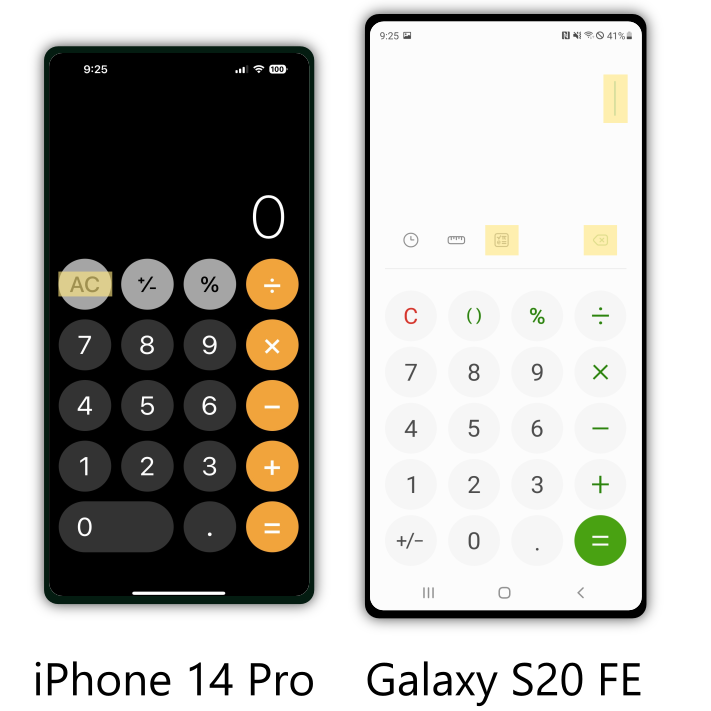
Key Differences in Calculators (Highlighted in Yellow)
The saddest part here is how much unused vertical space the iPhone still has! Look at all that space above the number 0. There’s absolutely no reason they couldn’t have added a helpful menu bar with some buttons to enable scientific mode and backspace like Android. Additionally, the apps look almost identical! I think there is a clear winner in UX here, but maybe you think differently.
Keyboards
And now, for the keyboard. Take a look at the difference in the keyboards:
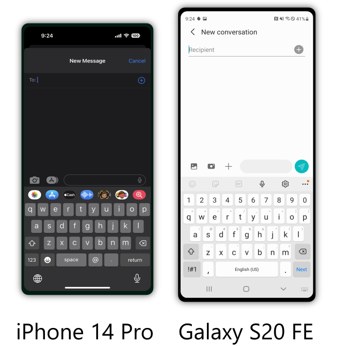
Keyboards
Once again, there are a few things I’d like for you to notice. For the first thing, take a look at the bottom row on both keyboards.
On iPhone, there is no comma key, instead you get a key to open up emojis and a key for the “@” symbol. On Android, the emoji key is listed further up the keyboard in the menu bar (along with stickers, gifs, voice messages, etc). But, notice how the bottom row has a comma key instead of the “@” symbol.
Edit (after about 2 weeks): I’ve since noticed, the reason my screenshot has the “@” symbol and period key are because I was entering in contact information. Yea, you heard that right. The keyboard changes depending on what you’re doing. So not only are all the things I’m about to say true, the keyboard randomly changes when you enter a URL into Safari, or contact info, or whatever. Ftkdkfdfdsjktafdkasdfjk. Yea, that’s all I have to say to that. Here, have some fun reading about other annoyed users ranting about keyboards.
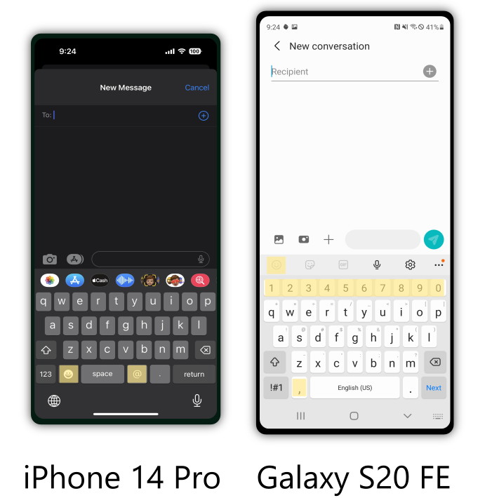
Key Differences in Keyboards (Highlighted in Yellow)
Now, I imagine the reasoning for the iPhone’s layout went something like this…
*Somewhere in a Cupertino board room*
Design Lead(Newman): We have limited real-estate on these keyboards. We want to maximize utility for people’s big, dumb, fat thumbs. Which keys should we prioritize?
Designer(George): Well, I think the user’s alphabet should definitely be visible. So for English, we need to list the letters A-Z.
Rest of the Designers: Hmm, yes. Good point.
Design Lead(Newman): Great point! Alright, so we’ll include the English alphabet. That leaves us with… hmm, 8 additional keys. What else?
Designer(Elayne): Well, we also need some common formatting keys. I think the space, enter, backspace, capitalization, and the alt key for numbers and other symbols are hard requirements.
Rest of the Designers: Brilliant, yes of course. Formatting!
Design Lead(Newman): Great points Elayne, this is why we pay you the big bucks. We have 3 keys left, suggestions?
Designer(Jerry): Well, people tell me I’m punctual, and you know punctuation is important to me, that’s why they call me punctual right…? So, I think we need the period key and the comma. I’m also expressive, so we need some way to get to our emojis. Of course the last key would have to be emojis.
Rest of the Designers: Hmm… yes, emojis. Punctuation, of course…
Design Lead(Newman): Jerry, you jokester! Of course we want punctuation and emojis, but you forgot to mention Twitter?! And, speaking of Twitter mentions, how the heck am I supposed to angrily reply to those idiots on Twitter unless I have quick access to my “@” key! Punctuation and emojis are important, but nobody pauses these days. It’s all go go go. So of course, the comma goes and we’ll use the “@” key instead.
Rest of the Designers: *Break into applause* Brilliant! Of course, Twitter! How could we forget?
Designer(Jerry): *Mutters under breath* Newman…!
*Back to reality…*
Of course, this is why the iPhone boldly decided to place the “@” key where the comma key clearly should have gone.
Aside from that, notice how the iPhone keyboard also doesn’t place the number keys on the main keyboard whereas Android does. Once again, look at all the wasted vertical space in the iPhone! I can tell you from experience, the typing is just as easy on Android as iPhone (even with Android’s extra keys). But the typing on iPhone SUCKS when you have to go to the alt keys every time you need to place, a, damn, comma.
Edit (after about 2 weeks): It turns out, text selection also SUCKS on iPhone. You can either long press the space bar key, and get a floaty cursor bar with no haptic feedback to reposition your text cursor, or you can click on the text itself and have the text cursor go anywhere except where you clicked. Selecting text is similarly horrible. These things are not issues on Android, because it just works. More rants from Reddit about text selection.
Also! I had the Spanish keyboard enabled because I was trying different keyboards to see if there was a way around these issues and accidentally enabled Spanish, and in the middle of my typing the keyboard would just switch to Spanish! I don’t know if I accidentally tapped Spanish or something or what happened. So I had to remove the Spanish keyboard and now it thankfully stays in English when I type.
Opera
Finally, we get to custom 3rd party apps. Surely Apple’s obsessionfocus on minimalism doesn’t extend to 3rd party apps does it? Ha! You poor ignorant child…
I present to you, Opera (my current preferred browser):
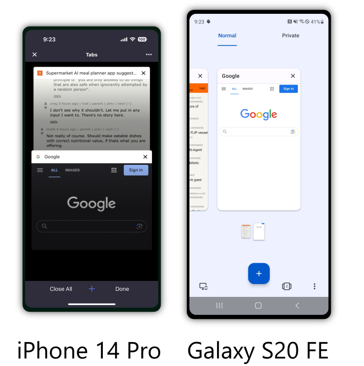
Opera
Immediately you can see there are some big differences in the two apps. I took a screenshot in both apps on the mode that shows all active tabs, because that’s where I think these differences present themselves in the most impactful way.
Notice how on the Android there are two tabs at the top: “Normal” and “Private”. If you want to switch to private browsing, you just click the tab and it switches. On iPhone, they hide the private browsing mode in those small 3 dots. I’m assuming it’s because it “clutters” the interface.
Next, notice how the “+” button for opening a new tab is big and bold on Android. It’s very easy to find. On the iPhone, it’s hidden away in that bottom tab.
The last stark difference is on Android you swipe left to right to scroll through tabs (which I disliked at first but now vastly prefer), whereas on iPhone you swipe top to bottom.
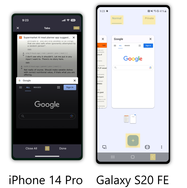
Key Differences in Opera (Highlighted in Yellow)
These differences are very small, but they all do the same thing: iPhone actively hides elements that “clutter” the interface. This, in my opinion, vastly deteriorates the usability of the app.
Why should I have to click through a bajillion menus to find the thing I want when there’s plenty of space available to list it in the main screen?
One other big difference that was jarring to me: on Android I got into the habit of just pressing the back button in the bottom right to go back to a different web page (it’s the same on all browsers on Android as far as I know).
On iPhone, you either swipe left to go back, or scroll up a bit then click the back arrow in the bottom left. Both of these feel kind of awkward, but I don’t know if this really impacts usability. It did feel icky to me though.
So there you have it! The dumb-ified UIs of the iPhone kinda suck…
Performance + Battery Life
That’s nothing though compared to the next topic!
The performance is kind of terrible on iPhone. At least for games.
Edit (after about 2 weeks): I did some benchmarks on my Android and the iPhone, and the iPhone actually beats my Android by a large margin on performance. I can only guess the issues I illustrate in this section occur because of Apple’s decision to use their own custom graphics API (OpenGL ES has been deprecated since IOS 12) instead of using the widely standardized OpenGL ES API that is prevalent on all Androids. I’m guessing, this leads to popular game engines having little support for Apple specific graphics APIs (probably using some sort of emulation layer) that results in crappy performance for cross-platform games. All of this is just conjecture though, and the benchmarks certainly show that the iPhone clearly does have the capability to perform much much better than my Android.
Let me illustrate with one game that I played on both Android and then iPhone: Daily Dadishthe Dadish games are great by the way, go get them and play all of them. And what better way to illustrate than with a video?
Try to guess which one you think is slower in the first 15 seconds before I label the devices:
Now, it’s very subtle, but there’s a big difference when you’re playing the game (and hopefully YT compression didn’t ruin my point haha). The iPhone very visibly lags as I’m playing the game and this really messes with me.
In regards to the battery life, they’re about equal. In my daily use with my Android, I would usually end the day with around 70% battery life. The iPhone is the same.
Honorable Mentions
God, why, the scrollbars?! They are impossible to grab on the iPhone. I don’t know why this is, but I felt like it was way easier to grab scrollbars on Android.
Every time I mess up a gesture, I lose a little bit of sanity. This won’t end well…
The lock button on my iPhone case is super hard to press. Welp, I guess I can just leave my phone unlocked all the time.
How do I silence the phone? Turning it all the way down still leaves some sounds on…?
Edit (after about 2 months): Oh! It’s just the little tiny 2 millimeter big switch hidden on the side of the phone. Pshaw, how could I have missed that giant switch that clearly screams, “Switch this tiny switch with the very edge of your thumbnail to silence your phone!”?
No, I DO NOT WANT ICLOUD. No means no, quit bugging me with fake notifications saying my iPhone isn’t backed up. I KNOW THAT. I’ve KNOWN that. Once is enough.
Why does the wallpaper selection suck? No live wallpapers, no broad selection, no curated pictures from Apple. Just a few crappy designs that come with the phone. I like to add a bit of personality to my phone, why can’t I pick a cool wallpaper?
Volume control is terrible. On Android, I can pick one of like four volume controls (all clearly labelled) to control volume for media, calls, texts, notifications etc. On Apple, there’s one volume bar for ringtone (that doesn’t let me take it all the way down) and one for media (that only shows up while I’m playing media). This is annoying to say the least.
The good
App Integrations are Nice
1Password integration works better than on Android. On Android, it wouldn’t always detect password fields and/or show 1Password when I was trying to use it. Apple seems to always get it right.
Android Auto vs iPhone’s car integration. Android Auto is terrible and should burn a fiery death. It never connects properly the first time, it’s super slow, and I hate it.
iPhone’s auto integration is pretty nice (with the exception of Apple maps telling you turn with 0.1 microseconds to react). So yea, that’s cool.
Screencasting. Android has gotten a bit better, but nothing beats AirPlay.
All in all, Apple kind of lives up to the hype here. Things have gotten better in the Android world, but it still isn’t quite the same quality as Apple’s integrations.
Widgets
The flashlight is there as soon as you open the lock screen. That’s nice, my Galaxy didn’t do that.
There’s an ambient sound widget that generates soothing sounds. I use a box fan to sleep, but when I travel I don’t take it with me. iPhone has a little ear icon that you can add to your widgets. This allows you to play ambient sounds like white noise, or running water. This is very cool, and I’m definitely using it on future trips!
Screen recording widget. It’s not possible to capture a recording of your screen on Android unless you install a 3rd party app. With iPhone, I can just click a record button widget and it will record my screen. This is really cool.
Swiping to Delete
In the messages app, I can swipe left to delete a conversation.
In the recent calls app, I can swipe left to delete a call.
On the lock screen, I can swipe left to clear a notification.
These are small things, but the consistency and ease of use is a nice win for Apple.
Security
Apple is very focused on securing the privacy of their users. They have said no to governments in the past when the government has asked them to hack into their phones or provide a backdoor. They continue to lock down apps so they can’t steal your information without asking. They add features like a little light next to your camera to let you know it’s on.
There are several other examples that show how Apple is dedicated to the security of their users. This is very nice, but 99% of people will not notice this stuff or care about it either way. Security is one of those things that nobody really cares about unless it goes wrong. So, while Apple’s dedication here is great and should be lauded, I don’t find this to be a feature that holds much sway over my choices.
Why?
Before I end this, I just wanted to ask, why does the iPhone kinda suck? The one common thing I found when going through Reddit after looking for a feature that wasn’t supported was users complaining about how Apple removed that feature in an iOS update. I think if I had bought an iPhone 10 years ago, I would have vastly preferred it to an Android.
Well, I guess people have long memories. Apple has slowly been removing perfectly fine features. Probably because they don’t want to spend effort supporting them, not because they actually need to be removed. Users complain every time a feature they liked is taken away, but they think Androids still suck because of their past experiences with them.
I hope this article has shown that the iPhone really isn’t all that it’s cracked up to be. It’s just a phone. An Android is just a phone. They’re largely the same, but, they have some critical differences. Apple’s rigidity when it comes to customizability and their disdain towards backwards compatibility will probably come back to bite them.
I hope by writing this article, I’ll encourage anybody with the means to try an Android instead next time. Who knows, you might even like it?
What Now?
Well, this has been my experience so far. Will I switch back tomorrow? Hecks nah. Switching all my passwords, 2FA, data, accounts, … took forever.
Will I buy a new iPhone the next time I need a new phone? I honestly don’t know. Right now though, I’m leaning towards switching back to a Galaxy (or Pixel or some other Android) when the time comes for me to buy a new phone.
Edit (after about 2 weeks): I will definitely buy an Android again after a year. The main reason is the keyboard. It’s terrible and I hate it with a passion. I also hate spending $1000 on a new phone when I don’t need one, but I honestly don’t think I ever want an iPhone again after this. I’ll update this article again once I switch back.
I hope you enjoyed this, and I would be very interested to see an article like this for anyone that does the reverse switch (iPhone -> Android).
If you write an article like that, let me know! My contact info is in the About page. Who knows, if I like what you say I might even link it here haha.
Anyways, thanks for reading!